NovoPayment Website Redesign
NovoPayment is a fin tech company that provides a financial API platform for banking, acquiring, payments, and card solutions.
Duration
4 month project
Role
Product Designer @ Rainfall
The Problem
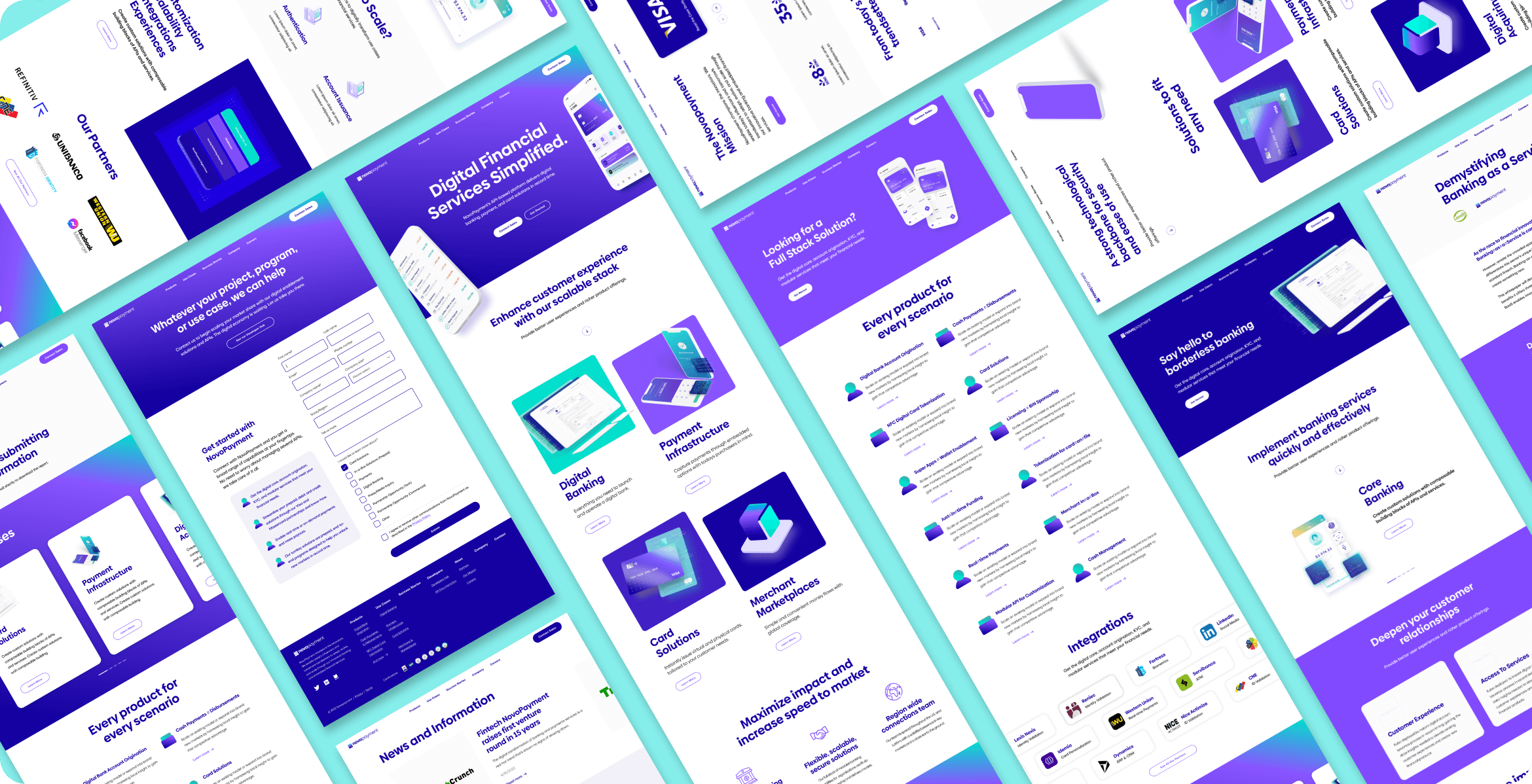
At the project’s inception, NovoPayment’s website lacked cohesiveness, personality, and brand trust, primarily due to insufficient details about their product offerings. Users found the information vague and unidentifiable, which impeded Novopayment's expansion from South America into the North American market. The site’s previous design was cluttered and did not effectively communicate the value of NovoPayment's services.
The Goal
The primary objective was to redesign NovoPayment’s website to:
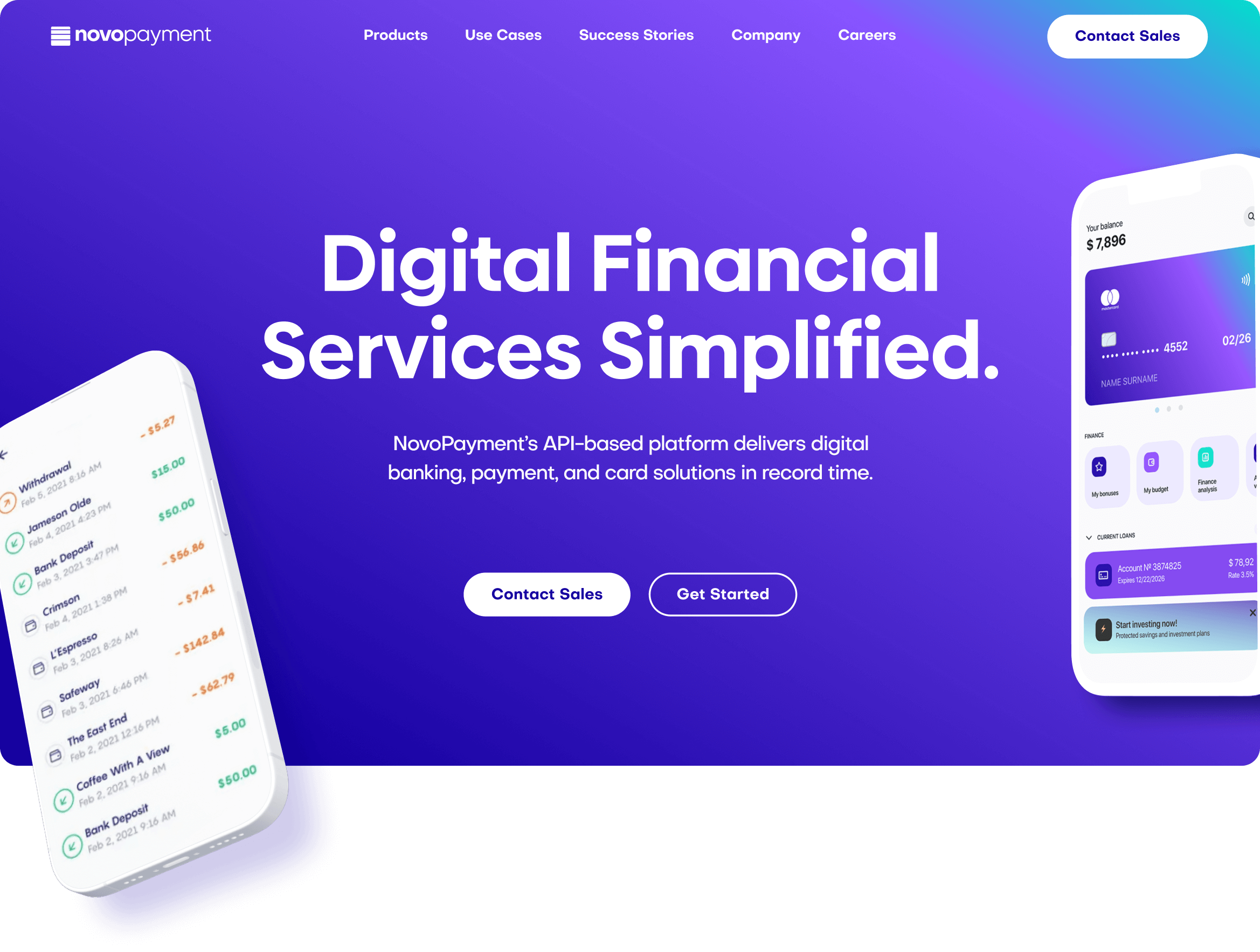
- Enhance brand personality and presence
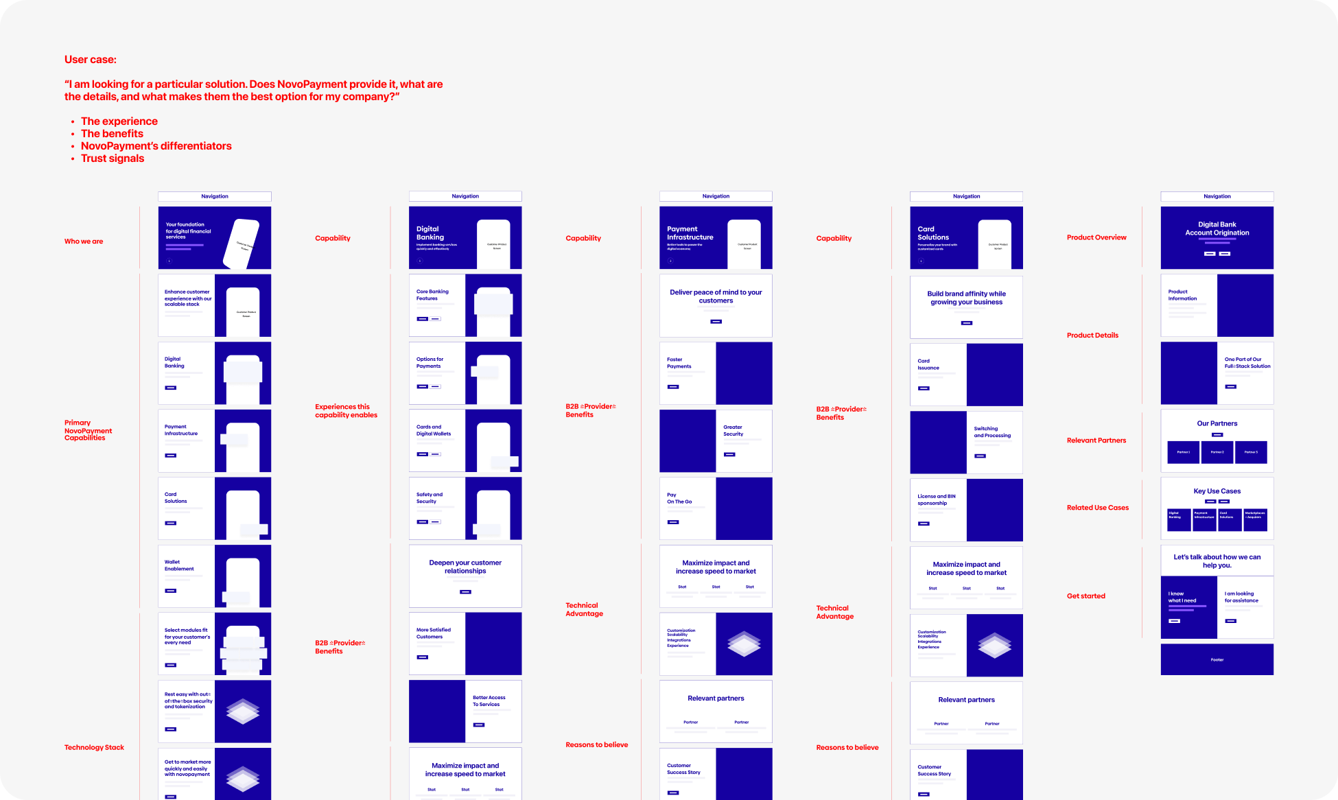
- Improve product information architecture
- Make Novopayment’s offerings more accessible to non-tech and non-banking individuals
Additionally, the project included extensive content design to clearly present NovoPayment's services and solutions.
Process
Discover
Identify pain points & missed opportunities
Define
Strategy, setting objectives, scope
Design
Wireframes, solutions, prototypes
Deliver
UI design, microinteractions, development, QA
Research
Competitor Audit
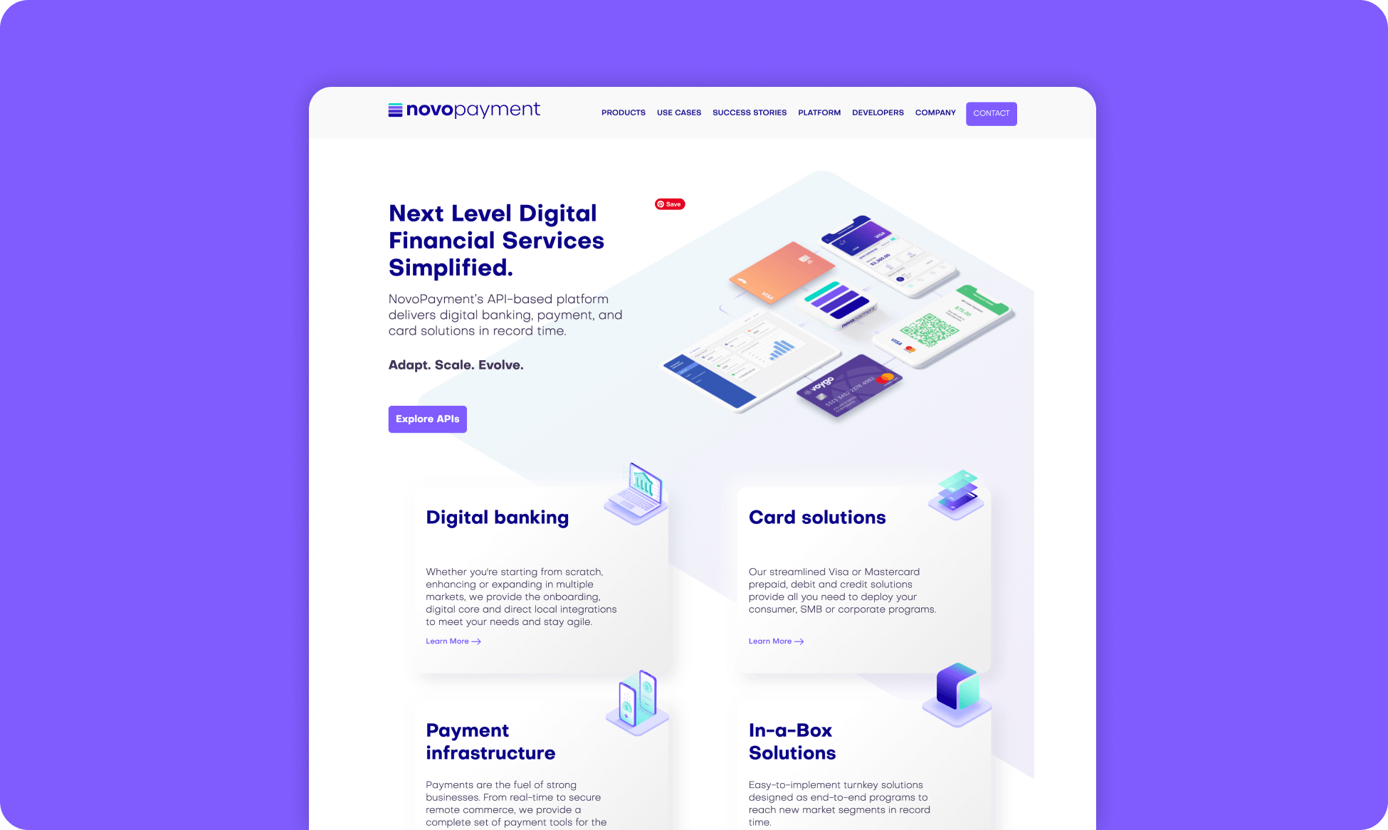
An analysis revealed that NovoPayment’s site was indistinguishable from those of many fintech competitors.
Customer Feedback
Previous customers reported that the site complicated their decision-making process due to the lack of clear information about NovoPayment’s offerings. The main positive aspect was the ability to contact NovoPayment for a demo.
Access Issues
Important customer capture points such as case studies, blogs, mission pages, and career information were either missing or hard to find.
Key Learnings & Needs
- Robust Brand Personality
The site needed to reflect a stronger, more cohesive brand identity. - Clear Information
Users required concise, detailed information about NovoPayment’s product offerings. - Additional Company Information
Trust-building content like company history, mission, and values needed to be more accessible. - Improved Access
Easy access to case studies, white papers, and the demo call-to-action (CTA) was necessary.
Framing the Problem
How might we enhance NovoPayment’s brand to build trust and clearly communicate their service offerings?

Proud member of Queer Design Club + Techqueria.
©2024 MIKE PATRUNO DESIGN