Amazon delivery notifications
The Amazon Delivery Experience (DEX) team, a core product team, is responsible for managing all experiences within the purchase and post-purchase space, ensuring that customers have a seamless and informative journey.
Duration
6 month project
Role
UX Designer III
Impact at a glance
- Redesigned 18 core notifications for 8 global markets
- New tech stack increased design & develop speeds
- 100% design system & accessiblity compliance
THE PROBLEM
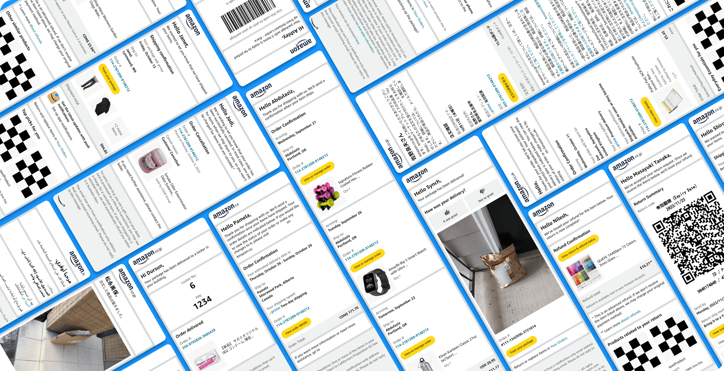
Outdated delivery emails eroded the brand image & customer trust
Amazon's delivery email notifications were outdated, failing to reflect the standards of a global brand. This neglect resulted in notifications containing obsolete programs and practices. Customers reported that their email notifications were difficult to parse. Also, the lack of consistency between the product experience and these notifications deteriorated brand trust.
THE GOAL
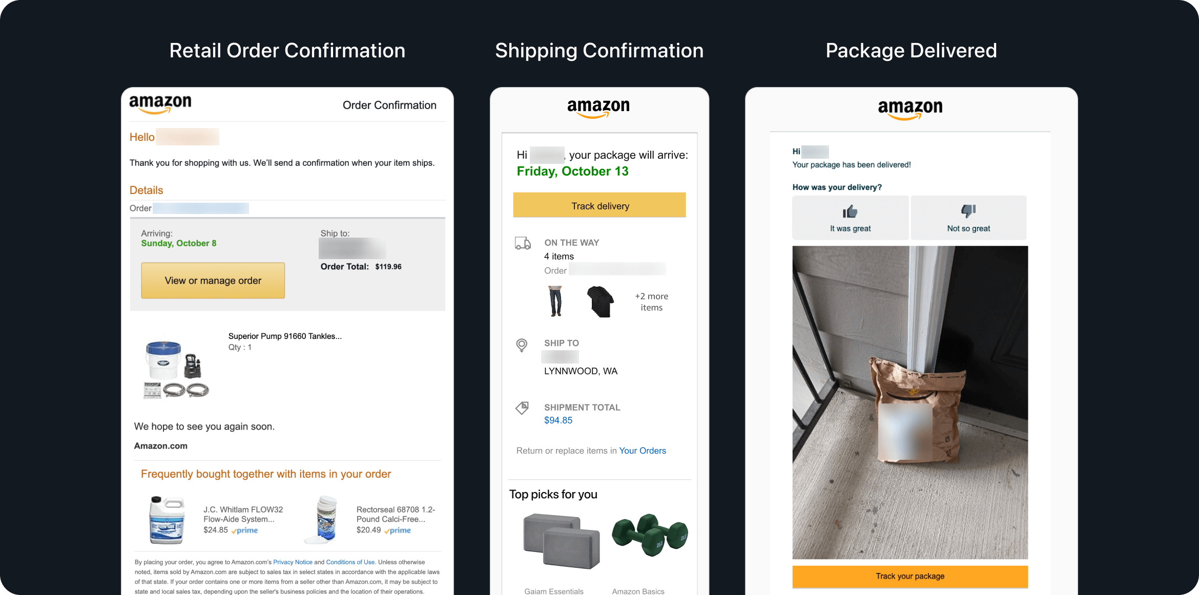
Redesign & update core email notifications with ease of use and accessibility in mind
The primary objective was to:
- Achieve 100% compliance with the Rio design system
- Redesign 18 high-volume email notifications across 8 global markets to improve experiences and provide customers with easy access to critical purchase information
- Ensure quality and accessibility across all email notifications
Process
Discover
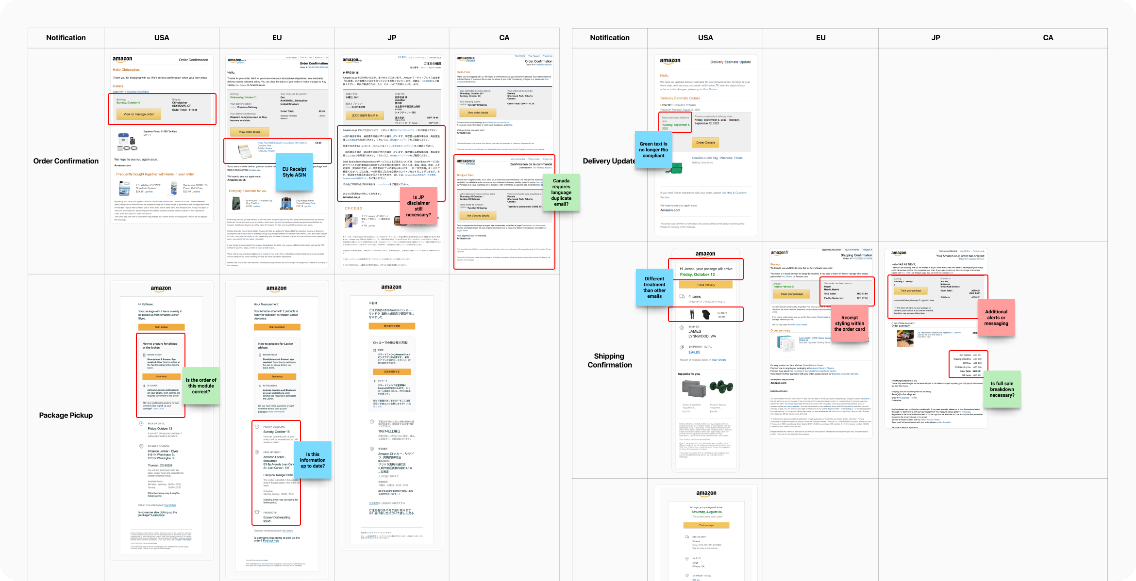
Audit and identify gaps in the current design system, identify all edge cases
Define
Strategy, setting objectives, scope
Design
Initial designs, iterations, final designs
Deliver
UI design, improved UX
Research
Competitor audit
Analyzed competitor notifications to benchmark best practices and identify opportunities for improvement.
Current design system audit
Conducted a comprehensive audit of the existing email notifications across all markets to identify gaps and outdated components.
Identify edge cases and market requirements
Examined all possible variations in ordering programs, language support, and legal requirements across different markets. Collaborated with UX, product, and legal teams to ensure all edge cases were addressed.
FRAMING THE PROBLEM
How might we improve notifications so that customers can better use email to track and find information related to their order?
Key component wireframing
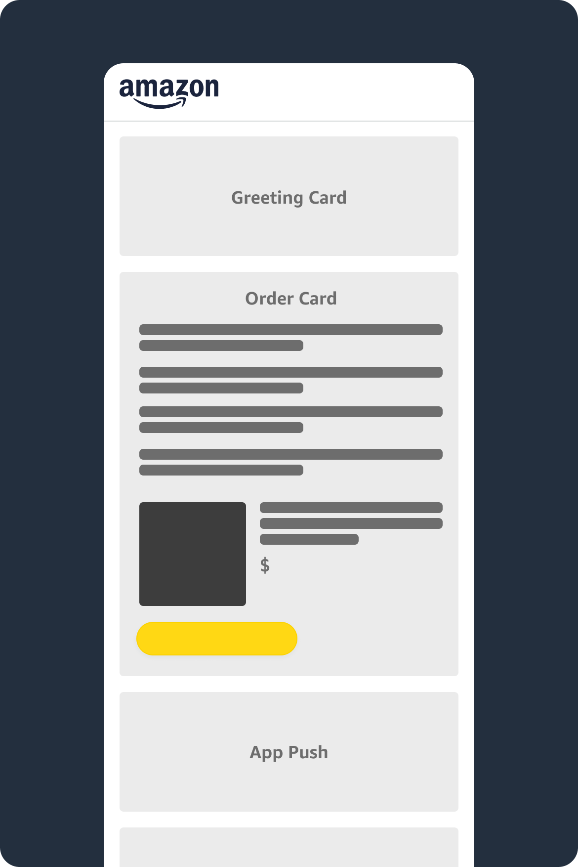
We created wireframes for essential components of the email notifications.
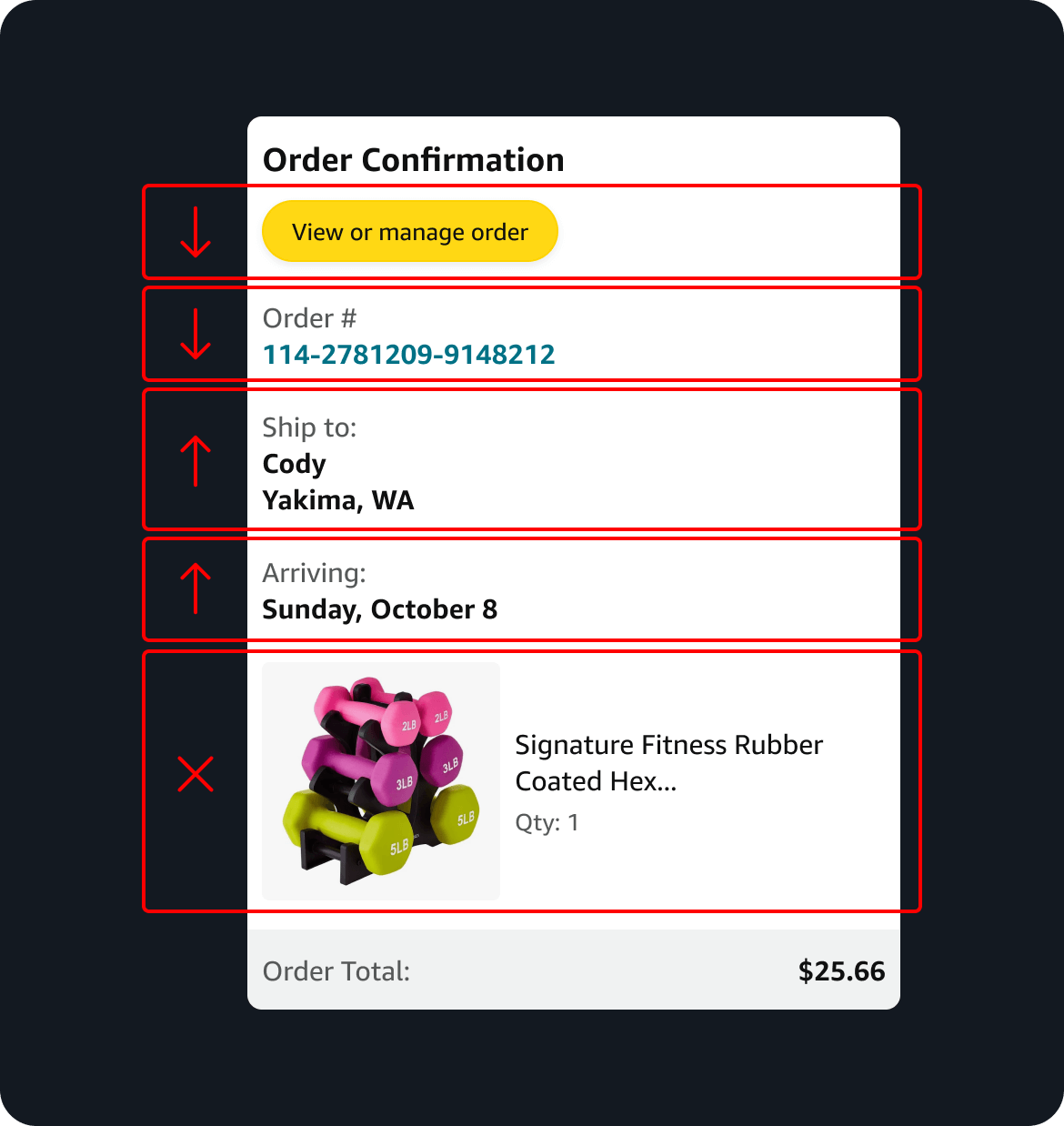
Information restructuring
The team designed the information order and what information was even displayed to highlight the most pertinent details upfront. Making it easier for users to access delivery information and reflect in-app experiences.
Atomic methodology
Utilized atomic design principles to ensure consistency and scalability.
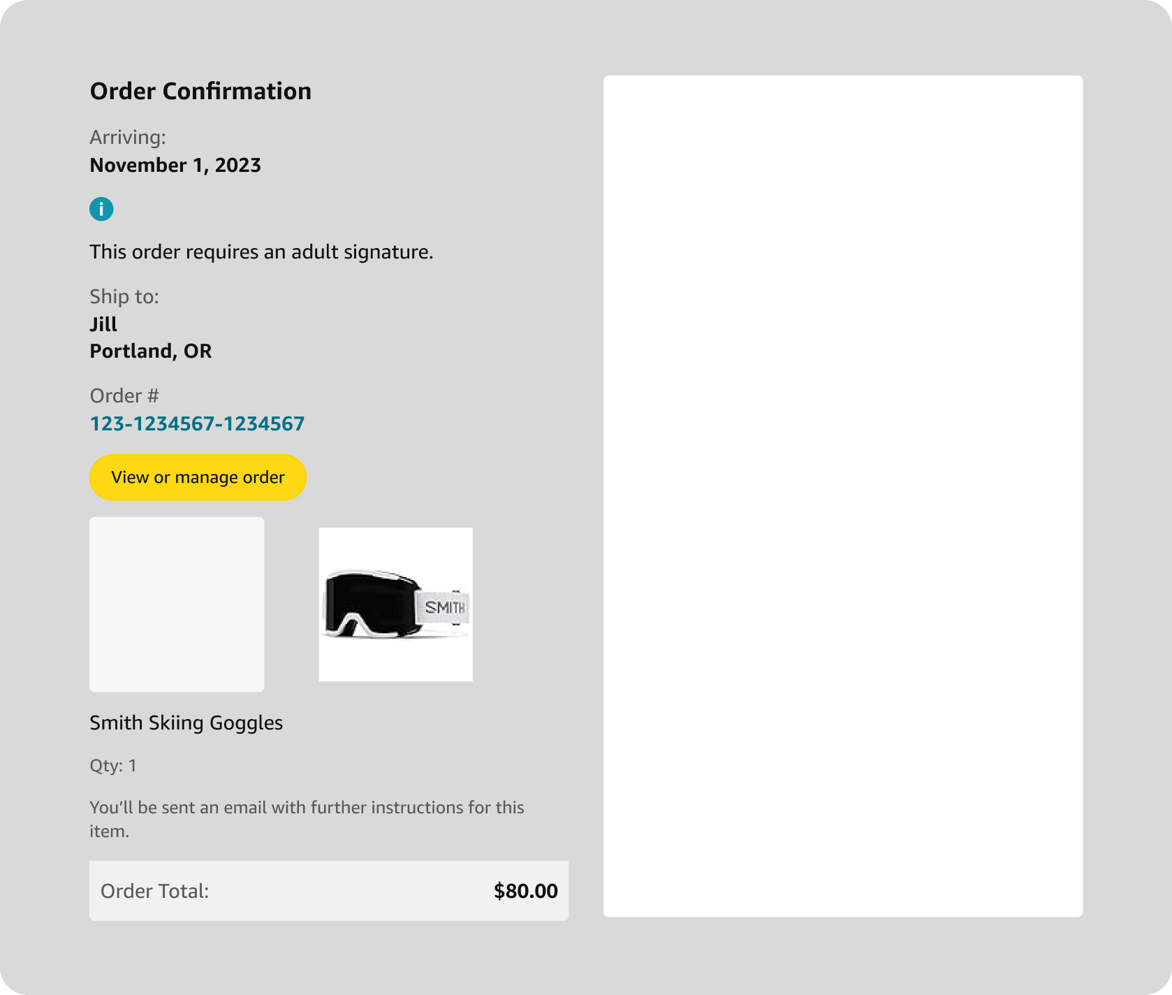
THE GOAL
Updated visual design to align with the Rio design system.


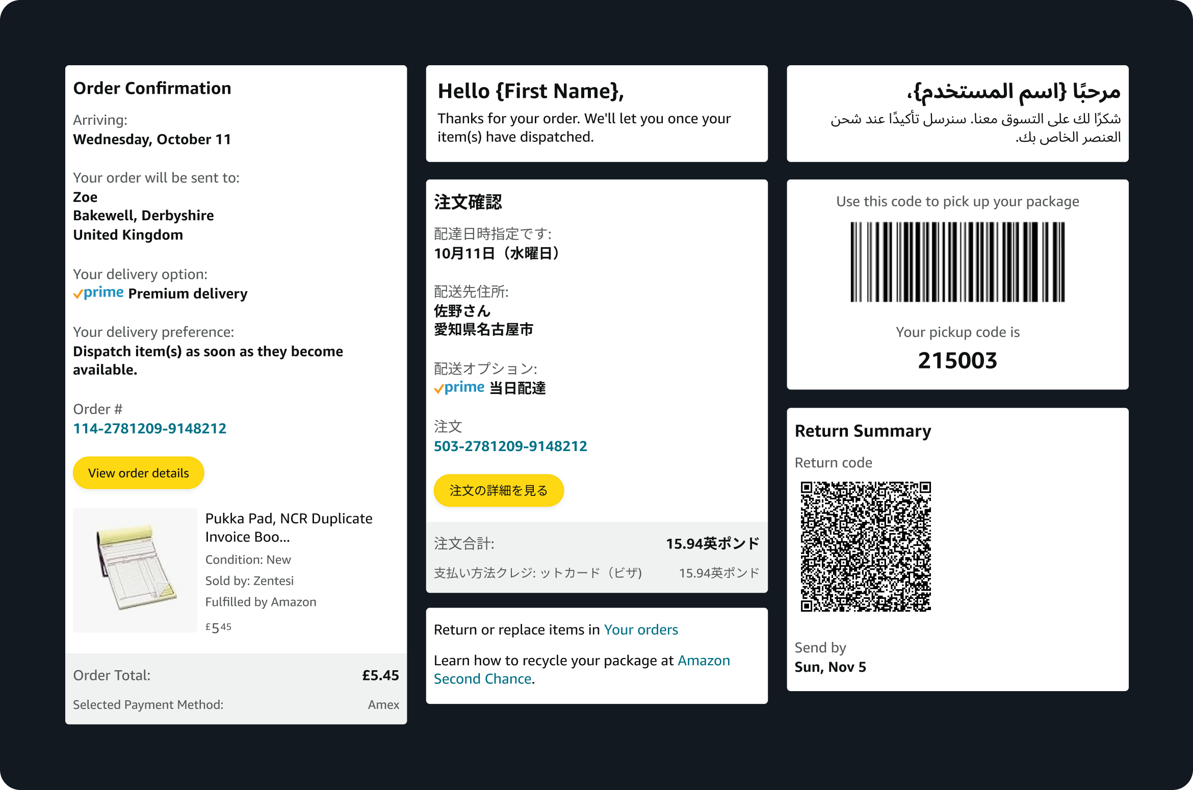
Edge cases
Designed solutions to accommodate various edge cases and market-specific requirements.
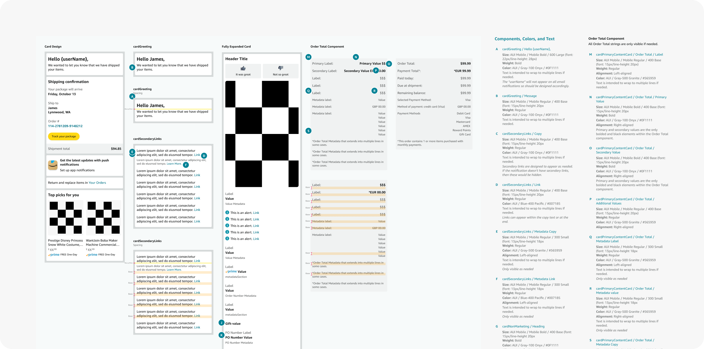
Dev redlines & annotations
Provided detailed redlines to developers to ensure accurate implementation.
Outcomes
“Finally! These emails are so easy to understand now.”
Customer feedback
Efficiency gains
Reduction in the time needed to design new emails
Reduction in the time needed to develop new emails
Compliance
Achieved 100% compliance with accessibility and parent brand standards for all new emails.
Proud member of Queer Design Club + Techqueria.
©2026 MIKE PATRUNO DESIGN