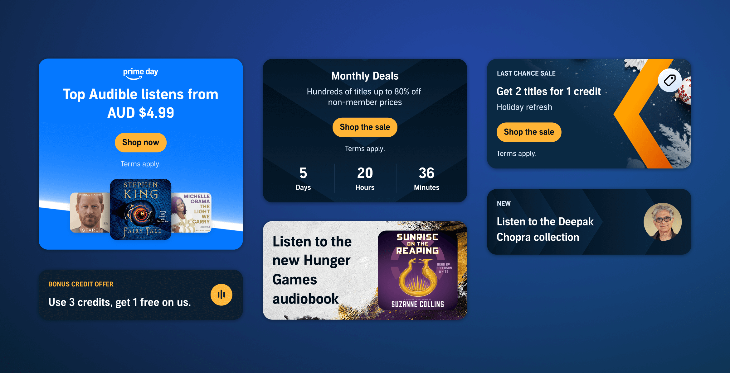
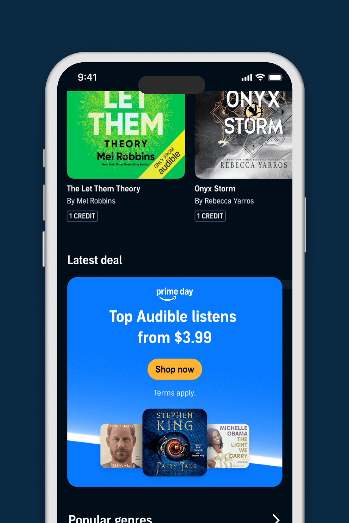
The Audible promo tile
Audible is an audiobook and podcast service, home to the world’s largest library of spoken-word content. This case study details the development of a flexible, high-yield promotional tile designed to highlight limited-time offerings while adhering to accessibility standards that significantly enhance revenue potential.
Duration
3 months
Role
Product Designer, Design Systems
Impact at a glance
- Increased campaign-to-market speed by ~30%
- Enhanced accessibility
- ~5% lift during our 1 week year-end sale
 Jump to solution
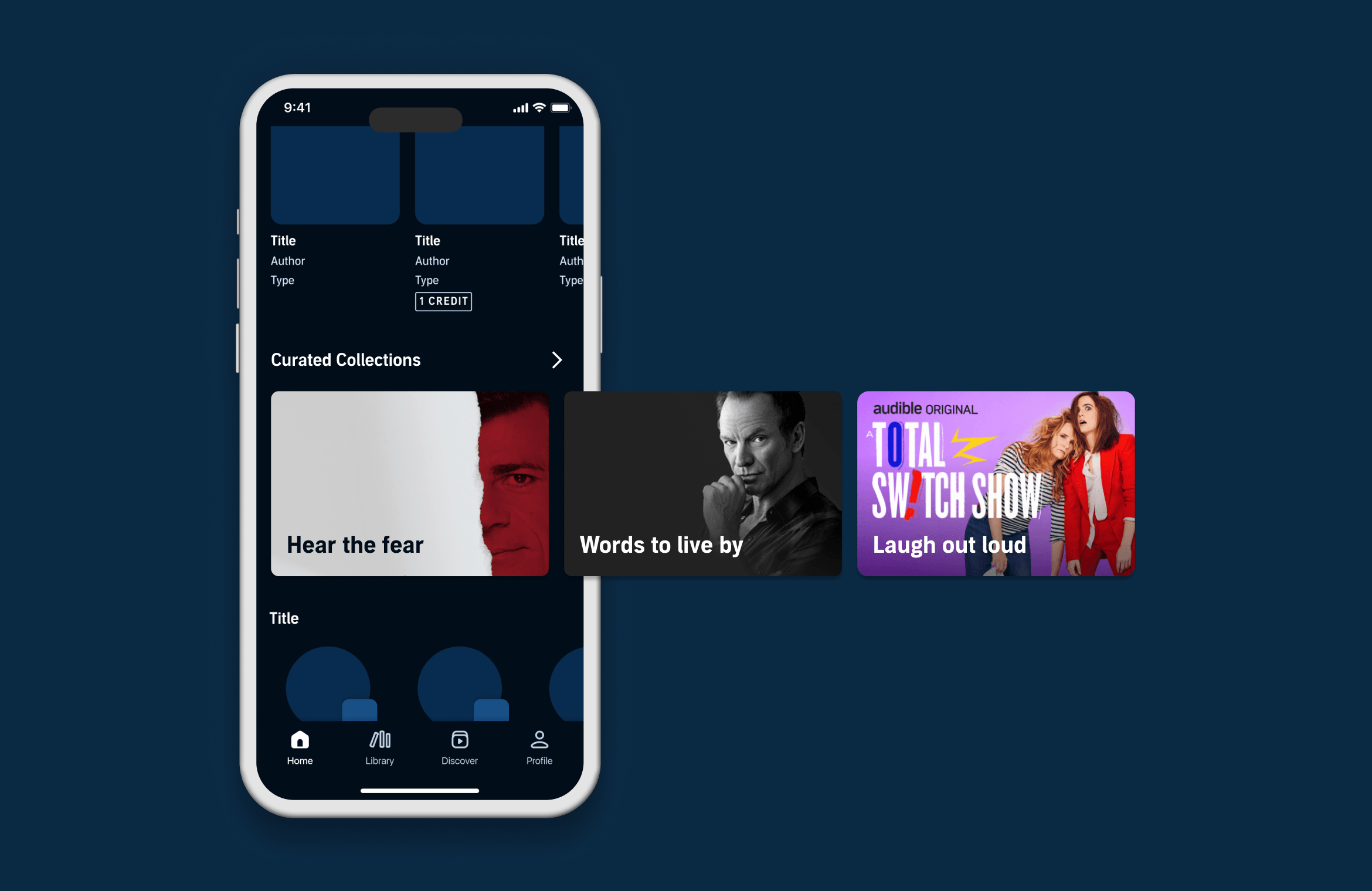
THE PROBLEM
Outdated designs limited modern campaign needs leading to component misuse
Audible's previous promotional tiles faced several limitations:
- Design overhead: Each marketing campaign required excessive design effort for each placement.
- Accessibility deficiencies: Existing promotions lacked accessibility features.
- Outdated layouts: Older component did not support data-driven marketing optimizations.
Leading to limited campaign effectiveness and accessibility risks.
THE GOAL
Design and implement a flexible, accessible, and scalable campaign component
We aimed to:
- Provide stakeholders with a new dynamic promo tile that can support a range of campaigns.
- Lower design overhead per campaign.
- Implement accessibility features that were previously impossible with older methods.
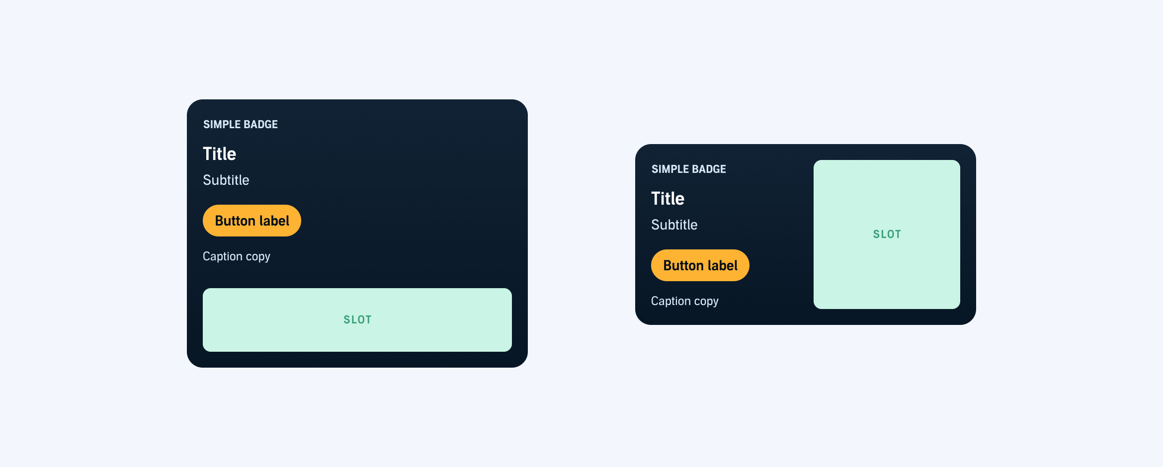
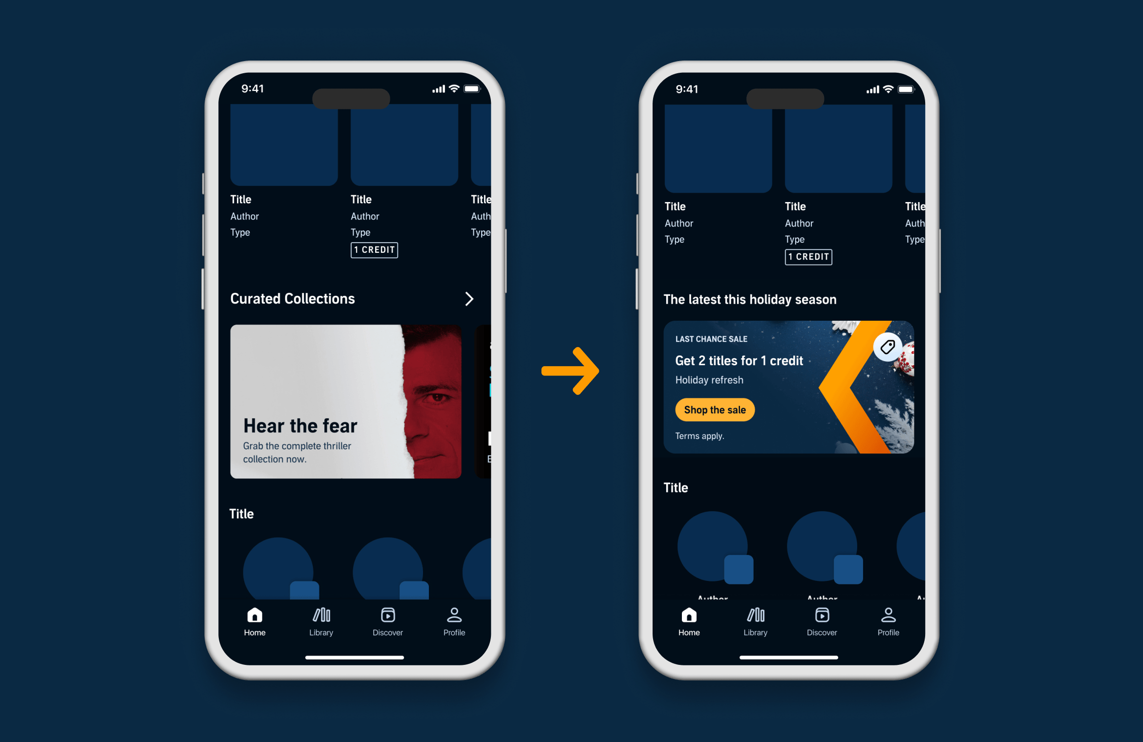
THE SOLUTION
A slot-based approach for the Swiss Army knife of banners
Using slots allowed us to separate structure from content, enabling flexible composition while enforcing consistent hierarchy, spacing, and accessibility standards across all variants.
Guidelines
Usage
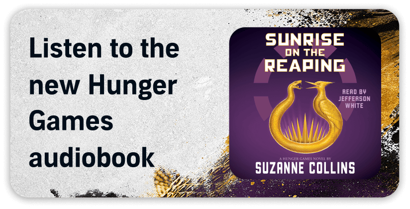
Promo tiles are visually dynamic components that highlight limited-time offerings with compelling urgency.
Placement
Ideal at the top of high-traffic pages or following typical user interaction areas.
Interaction
Promo tiles are single tap targets that direct users to promotional content or deals.


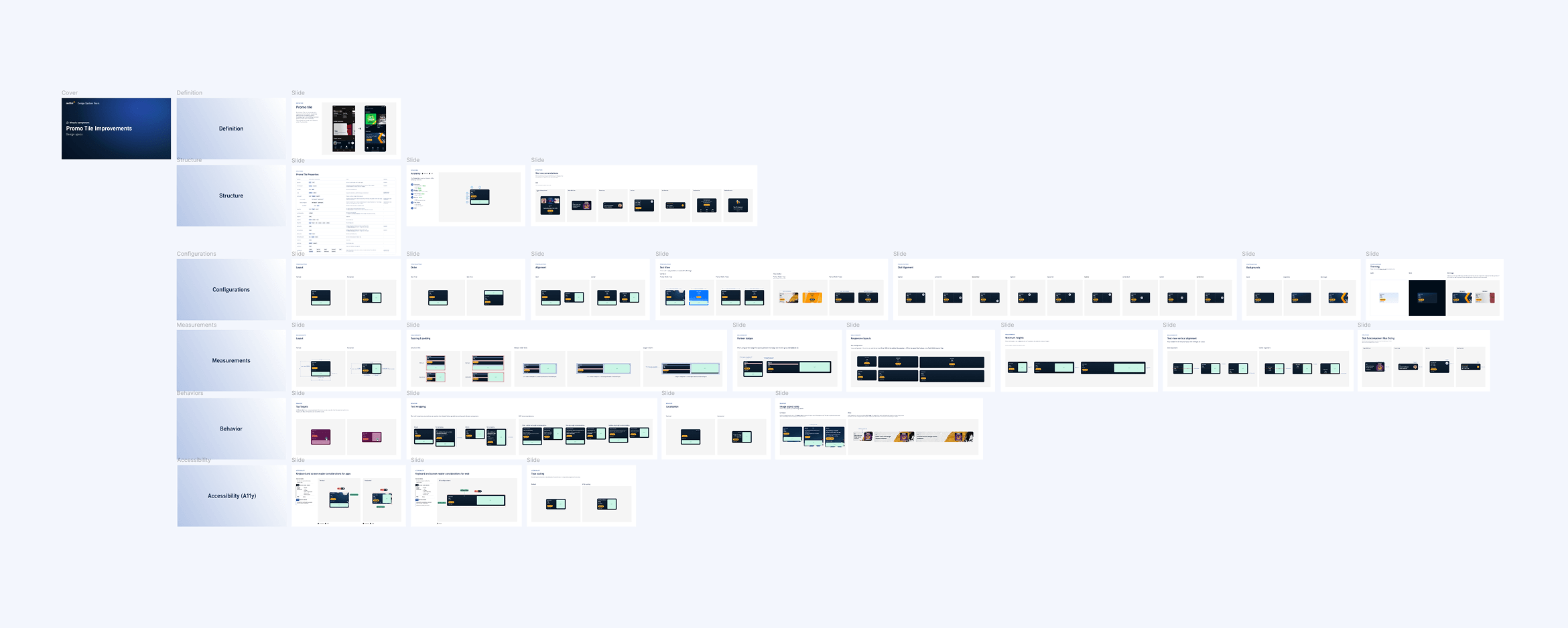
Implementation & handoff
The documentation covers:
Structure & layout
Slot configurations, alignment, dimensions, spacing
Visual styling
Background options, light/dark theming, imagery best practices
Behavior & responsiveness
Interaction patterns, responsive behavior
Accessibility
Text wrapping, localization, type scaling, screen reader considerations
Outcomes
Revenue gains
Exceeded our projected revenue target and saw a ~5% lift during our 1 week year-end sale.
Efficiency gains
Reduced design overhead while increasing campaign-to-market speed by ~30%.
Compliance
Enhanced accessibility features in a previously low-accessible marketing approach.
Interested in a more detailed case study?
Proud member of Queer Design Club + Techqueria.
©2026 MIKE PATRUNO DESIGN